Scatterplot 2D and 3D
Calls matplotlib scatterplot with some extra tweaks, like plotting groups with a specific colour and annotating built in.
Parameters:
df: pd.DataFrame,
x: object --> string column name of the scatterplot values in the DF for the X
y: object --> string column name of the scatterplot values in the DF for the Y
title='' --> string title
xlabel='' --> string x label
ylabel='' --> string y label
colour=None --> either a string for the colour (e.g. HEX or "blue"),
z=None --> string column name of the scatterplot values in the DF for the Z if this is set will make it 3D
zlabel=None -->  string z label
add_legend=True --> adding the legend or not
points_to_annotate=None --> specific points that you want to annotate as a list of strings [label1, label2, ...]
annotation_label=None, --> column name (string) that the points that you want to label are in
figsize=(3, 3),
title_font_size=12,
label_font_size=8,
title_font_weight=700,
s=30 --> size of the points, 10 is small, 100 is large.
color_col=None --> a column that you want to colour by, these were the values set in colour (i.e. df[color_col].values
config={},
)
Config options = any of the parameters with the same name but with in a dictionary format instead, and also includes default parameters for the visualisation such as the font family and font.
Example config:
config={'palette': ['red', 'yellow', 'pink'],
       'figsize':(4, 5),  # Size of figure (x, y)
        'title_font_size': 16, # Size of the title (pt)
        'label_font_size': 12, # Size of the labels (pt)
        'title_font_weight': 700, # 700 = bold, 600 = normal, 400 = thin
        'font_family': 'sans-serif', # 'serif', 'sans-serif', or 'monospace'
        'font': ['Tahoma'] # Default: Arial  # http://jonathansoma.com/lede/data-studio/matplotlib/list-all-fonts-available-in-matplotlib-plus-samples/
}
Loading data
[1]:
import pandas as pd
from sciviso import Barchart, Boxplot, Heatmap, Histogram, Scatterplot, Violinplot, Volcanoplot, Line
import matplotlib.pyplot as plt

df = pd.read_csv('iris.csv')
df
[1]:
| sepal_length | sepal_width | petal_length | petal_width | label | |
|---|---|---|---|---|---|
| 0 | 5.1 | 3.5 | 1.4 | 0.2 | Iris-setosa |
| 1 | 4.9 | 3.0 | 1.4 | 0.2 | Iris-setosa |
| 2 | 4.7 | 3.2 | 1.3 | 0.2 | Iris-setosa |
| 3 | 4.6 | 3.1 | 1.5 | 0.2 | Iris-setosa |
| 4 | 5.0 | 3.6 | 1.4 | 0.2 | Iris-setosa |
| ... | ... | ... | ... | ... | ... |
| 145 | 6.7 | 3.0 | 5.2 | 2.3 | Iris-virginica |
| 146 | 6.3 | 2.5 | 5.0 | 1.9 | Iris-virginica |
| 147 | 6.5 | 3.0 | 5.2 | 2.0 | Iris-virginica |
| 148 | 6.2 | 3.4 | 5.4 | 2.3 | Iris-virginica |
| 149 | 5.9 | 3.0 | 5.1 | 1.8 | Iris-virginica |
150 rows × 5 columns
2D Scatterplot
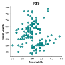
[2]:
scatterplot = Scatterplot(df, x='sepal_width', y='sepal_length', title='IRIS',
                          xlabel='Sepal width', ylabel='Sepal Length', add_legend=False)
scatterplot.plot()
plt.show()
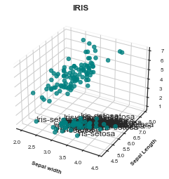
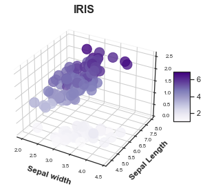
Scatterplot 3D
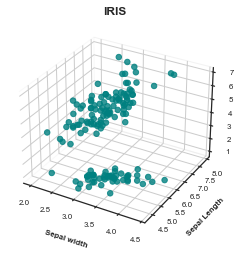
[3]:
scatterplot = Scatterplot(df, x='sepal_width', y='sepal_length',
                          title='IRIS',
                          xlabel='Sepal width', ylabel='Sepal Length',
                          z='petal_length',
                          add_legend=False) # Just need to add a z parameter
scatterplot.plot()
plt.show()
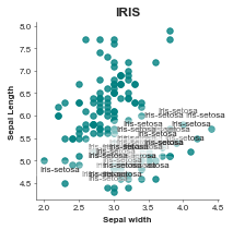
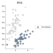
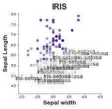
Annotate one of the classes on the chart
Add in the colour of each class as a row label.
[4]:
scatterplot = Scatterplot(df, x='sepal_width', y='sepal_length', title='IRIS',
                          xlabel='Sepal width', ylabel='Sepal Length',
                          points_to_annotate=['Iris-setosa'], # Could add the other ones in here
                          annotation_label='label',
                          add_legend=False) # What column those values come from
scatterplot.plot()
plt.show()
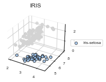
[5]:
# Do the same in 3D
scatterplot = Scatterplot(df, x='sepal_width', y='sepal_length', title='IRIS',
                          xlabel='Sepal width', ylabel='Sepal Length',
                          points_to_annotate=['Iris-setosa'], # Could add the other ones in here
                          annotation_label='label',
                          z='petal_length',
                          add_legend=False) # What column those values come from
scatterplot.plot()
plt.show()
Colour rather than annotate groups
[6]:
# Same initial setup
scatterplot = Scatterplot(df, x='sepal_width', y='sepal_length', title='IRIS',
                          xlabel='Sepal width', ylabel='Sepal Length') # What column those values come from

#
groups_labels = ['Iris-setosa'] # Could also do all groups but this is just showing how
# to highlight one
group_idxs = [[i for i, l in enumerate(df['label'].values) if l == 'Iris-setosa']]

scatterplot.plot_groups_2D(groups_labels, group_idxs)
plt.show()
*c* argument looks like a single numeric RGB or RGBA sequence, which should be avoided as value-mapping will have precedence in case its length matches with *x* & *y*. Please use the *color* keyword-argument or provide a 2-D array with a single row if you intend to specify the same RGB or RGBA value for all points.
[7]:
# Same initial setup
scatterplot = Scatterplot(df, x='sepal_width', y='sepal_length', title='IRIS',
                          xlabel='Sepal width', ylabel='Sepal Length',
                         z='petal_width')

#
groups_labels = ['Iris-setosa'] # Could also do all groups but this is just showing how
# to highlight one
group_idxs = [[i for i, l in enumerate(df['label'].values) if l == 'Iris-setosa']]

scatterplot.plot_groups_3D(groups_labels, group_idxs)
plt.show()
*c* argument looks like a single numeric RGB or RGBA sequence, which should be avoided as value-mapping will have precedence in case its length matches with *x* & *y*. Please use the *color* keyword-argument or provide a 2-D array with a single row if you intend to specify the same RGB or RGBA value for all points.
[8]:
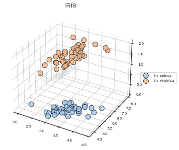
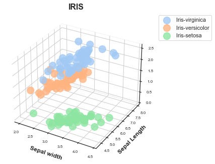
# Same initial setup
scatterplot = Scatterplot(df, x='sepal_width', y='sepal_length', title='IRIS',
xlabel='Sepal width', ylabel='Sepal Length',
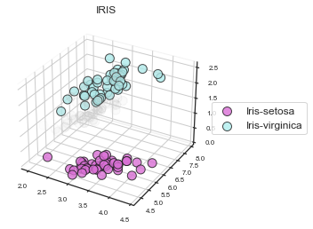
z='petal_width',
figsize=(5, 5), # Make the figure bigger.
s=100) # Make the size of the points bigger
#
groups_labels = ['Iris-setosa', 'Iris-virginica'] # Could also do all groups but this is just showing how
# to highlight one
group_idxs = [[i for i, l in enumerate(df['label'].values) if l == 'Iris-setosa'],
[i for i, l in enumerate(df['label'].values) if l == 'Iris-virginica']
]
scatterplot.plot_groups_3D(groups_labels, group_idxs,
alpha_bg=0.01)
plt.show()
# Since you can't see one group since it's behind other values, let's remove the background "grey points"
*c* argument looks like a single numeric RGB or RGBA sequence, which should be avoided as value-mapping will have precedence in case its length matches with *x* & *y*.  Please use the *color* keyword-argument or provide a 2-D array with a single row if you intend to specify the same RGB or RGBA value for all points.
*c* argument looks like a single numeric RGB or RGBA sequence, which should be avoided as value-mapping will have precedence in case its length matches with *x* & *y*.  Please use the *color* keyword-argument or provide a 2-D array with a single row if you intend to specify the same RGB or RGBA value for all points.
Advanced style options
Here are some examples with extra style options.
[9]:
scatterplot = Scatterplot(df,
                          x='sepal_width',
                          y='sepal_length',
                          title='IRIS',
                          xlabel='Sepal width',
                          ylabel='Sepal Length',
                          z='petal_width',
                          colour=df['petal_length'].values, # Colour on this values
                          zlabel=None,
                          add_legend=True,
                          points_to_annotate=None,
                          annotation_label=None,
                          add_correlation=False,
                          correlation='Spearman',
                          title_font_size=12,
                          label_font_size=8,
                          title_font_weight=700,
                          color_col=None, # Set points to be coloured by this column
                            # Config options = any of the parameters with the same name but with in a dictionary format instead
                             # You could also pass these as individual parameters, but it's easier to set as a dictionary
                            # also, then you can re-use it for other charts!
                          config={'s': 200, # Make points larger
                                  'figsize':(4, 5),  # Size of figure (x, y)
                                  'title_font_size': 16, # Size of the title (pt)
                                  'label_font_size': 12, # Size of the labels (pt)
                                  'title_font_weight': 700, # 700 = bold, 600 = normal, 400 = thin
                                  'font_family': 'sans-serif', # 'serif', 'sans-serif', or 'monospace'
                                  'font': ['Tahoma'] # Default: Arial  # http://jonathansoma.com/lede/data-studio/matplotlib/list-all-fonts-available-in-matplotlib-plus-samples/
                          })
scatterplot.plot()
plt.show()
[10]:
scatterplot = Scatterplot(df,
                          x='sepal_width',
                          y='sepal_length',
                          title='IRIS',
                          xlabel='Sepal width',
                          ylabel='Sepal Length',
                          z='petal_width',
                          colour=df['petal_length'].values, # This wil be overridden on color_col
                          zlabel=None,
                          add_legend=True,
                          points_to_annotate=None,
                          annotation_label=None,
                          add_correlation=False,
                          correlation='Spearman',
                          title_font_size=12,
                          label_font_size=8,
                          title_font_weight=700,
                          color_col='label', # Set points to be coloured by this column
                            # Config options = any of the parameters with the same name but with in a dictionary format instead
                             # You could also pass these as individual parameters, but it's easier to set as a dictionary
                            # also, then you can re-use it for other charts!
                          config={'s': 200, # Make points larger
                                  'figsize':(4, 5),  # Size of figure (x, y)
                                  'title_font_size': 16, # Size of the title (pt)
                                  'label_font_size': 12, # Size of the labels (pt)
                                  'title_font_weight': 700, # 700 = bold, 600 = normal, 400 = thin
                                  'font_family': 'sans-serif', # 'serif', 'sans-serif', or 'monospace'
                                  'font': ['Tahoma'] # Default: Arial  # http://jonathansoma.com/lede/data-studio/matplotlib/list-all-fonts-available-in-matplotlib-plus-samples/
                          })
scatterplot.plot()
plt.show()
*c* argument looks like a single numeric RGB or RGBA sequence, which should be avoided as value-mapping will have precedence in case its length matches with *x* & *y*.  Please use the *color* keyword-argument or provide a 2-D array with a single row if you intend to specify the same RGB or RGBA value for all points.
*c* argument looks like a single numeric RGB or RGBA sequence, which should be avoided as value-mapping will have precedence in case its length matches with *x* & *y*.  Please use the *color* keyword-argument or provide a 2-D array with a single row if you intend to specify the same RGB or RGBA value for all points.
*c* argument looks like a single numeric RGB or RGBA sequence, which should be avoided as value-mapping will have precedence in case its length matches with *x* & *y*.  Please use the *color* keyword-argument or provide a 2-D array with a single row if you intend to specify the same RGB or RGBA value for all points.
Saving
Saving is the same for all plots and v simple, just make sure you specify what ending you want it to have.
[27]:
scatterplot = Scatterplot(df, x='sepal_width', y='sepal_length', title='IRIS',
                          xlabel='Sepal width', ylabel='Sepal Length',
                          points_to_annotate=['Iris-setosa'], # Could add the other ones in here
                          annotation_label='label',
                          colour=df['petal_width'].values,
                          add_legend=True,
                          config={'palette': ['orchid', 'paleturquoise', 'gold'],
                           'figsize':(3, 3),  # Size of figure (x, y)
                           's': 20,
                           'title_font_size': 16, # Size of the title (pt)
                           'label_font_size': 12, # Size of the labels (pt)
                           'title_font_weight': 700, # 700 = bold, 600 = normal, 400 = thin
                           'font_family': 'sans-serif', # 'serif', 'sans-serif', or 'monospace'
                           'font': ['Tahoma'] # Default: Arial  # http://jonathansoma.com/lede/data-studio/matplotlib/list-all-fonts-available-in-matplotlib-plus-samples/
                           }) # What column those values come from
scatterplot.plot()
plt.savefig('scatter2D.svg', bbox_inches='tight') # .png, .pdf, .jpg
plt.savefig('scatter2D.png', dpi=300) # .png, .pdf, .jpg
plt.savefig('chart.pdf') # .png, .pdf, .jpg
[28]:
# Same initial setup
scatterplot = Scatterplot(df, x='sepal_width', y='sepal_length', title='IRIS',
                          xlabel='Sepal width', ylabel='Sepal Length',
                          z='petal_width',

                         config={'palette': ['orchid', 'paleturquoise', 'gold'],
                           'figsize':(5, 5),  # Size of figure (x, y)
                           's': 100,
                           'title_font_size': 16, # Size of the title (pt)
                           'label_font_size': 12, # Size of the labels (pt)
                           'title_font_weight': 700, # 700 = bold, 600 = normal, 400 = thin
                           'font_family': 'sans-serif', # 'serif', 'sans-serif', or 'monospace'
                           'font': ['Tahoma'] # Default: Arial  # http://jonathansoma.com/lede/data-studio/matplotlib/list-all-fonts-available-in-matplotlib-plus-samples/
                           }) # Make the size of the points bigger

#
groups_labels = ['Iris-setosa', 'Iris-virginica'] # Could also do all groups but this is just showing how
# to highlight one
group_idxs = [[i for i, l in enumerate(df['label'].values) if l == 'Iris-setosa'],
              [i for i, l in enumerate(df['label'].values) if l == 'Iris-virginica']
             ]

scatterplot.plot_groups_3D(groups_labels, group_idxs,
                           alpha_bg=0.01)
# Since you can't see one group since it's behind other values, let's remove the background "grey points"
plt.savefig('scatter3d.svg', bbox_inches='tight') # .png, .pdf, .jpg
plt.savefig('scatter3d.png', dpi=300) # .png, .pdf, .jpg
plt.savefig('chart.pdf') # .png, .pdf, .jpg