Boxplot
Parameters:
df: pd.DataFrame,
x: object --> string column name of the violinplot values in the DF for the X
y: object --> string column name of the violinplot values in the DF for the Y
title='' --> string title
xlabel='' --> string x label
ylabel='' --> string y label
hue=None --> column you want to colour by
order=None --> order of your values
box_colors=None, --> a list of colours to plot the boxes by --> only works in older version of matplotlib
showfliers=False,
add_dots=False,
add_stats=True,
stat_method='Mann-Whitney',  # options: t-test_ind, t-test_welch, t-test_paired, Mann-Whitney, Mann-Whitney-gt, Mann-Whitney-ls, Levene, Wilcoxon, Kruskal from: https://www.statsmodels.org/stable/api.html
box_pairs=None --> a list of box pairs i.e. comparisons for the statistics
figsize=(3, 3),
title_font_size=12,
label_font_size=8,
title_font_weight=700,
config={})
Config options = any of the parameters with the same name but with in a dictionary format instead, and also includes default parameters for the visualisation such as the font family and font.
Example config:
config={'palette': ['red', 'yellow', 'pink'],
       'figsize':(4, 5),  # Size of figure (x, y)
        'title_font_size': 16, # Size of the title (pt)
        'label_font_size': 12, # Size of the labels (pt)
        'title_font_weight': 700, # 700 = bold, 600 = normal, 400 = thin
        'font_family': 'sans-serif', # 'serif', 'sans-serif', or 'monospace'
        'font': ['Tahoma'] # Default: Arial  # http://jonathansoma.com/lede/data-studio/matplotlib/list-all-fonts-available-in-matplotlib-plus-samples/
}
Loading data
[1]:
import pandas as pd
from sciviso import Barchart, Boxplot, Heatmap, Histogram, Scatterplot, Violinplot, Volcanoplot, Line
import matplotlib.pyplot as plt

df = pd.read_csv('iris.csv')
df
[1]:
| sepal_length | sepal_width | petal_length | petal_width | label | |
|---|---|---|---|---|---|
| 0 | 5.1 | 3.5 | 1.4 | 0.2 | Iris-setosa |
| 1 | 4.9 | 3.0 | 1.4 | 0.2 | Iris-setosa |
| 2 | 4.7 | 3.2 | 1.3 | 0.2 | Iris-setosa |
| 3 | 4.6 | 3.1 | 1.5 | 0.2 | Iris-setosa |
| 4 | 5.0 | 3.6 | 1.4 | 0.2 | Iris-setosa |
| ... | ... | ... | ... | ... | ... |
| 145 | 6.7 | 3.0 | 5.2 | 2.3 | Iris-virginica |
| 146 | 6.3 | 2.5 | 5.0 | 1.9 | Iris-virginica |
| 147 | 6.5 | 3.0 | 5.2 | 2.0 | Iris-virginica |
| 148 | 6.2 | 3.4 | 5.4 | 2.3 | Iris-virginica |
| 149 | 5.9 | 3.0 | 5.1 | 1.8 | Iris-virginica |
150 rows × 5 columns
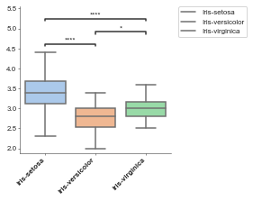
Basic boxplot
[2]:
boxplot = Boxplot(df, x='label', y='sepal_width')
boxplot.plot()
plt.show()
p-value annotation legend:
ns: 5.00e-02 < p <= 1.00e+00
*: 1.00e-02 < p <= 5.00e-02
**: 1.00e-03 < p <= 1.00e-02
***: 1.00e-04 < p <= 1.00e-03
****: p <= 1.00e-04

Iris-setosa v.s. Iris-versicolor: Mann-Whitney-Wilcoxon test two-sided with Bonferroni correction, P_val=8.950e-13 U_stat=2.306e+03
Iris-versicolor v.s. Iris-virginica: Mann-Whitney-Wilcoxon test two-sided with Bonferroni correction, P_val=1.372e-02 U_stat=8.410e+02
Iris-setosa v.s. Iris-virginica: Mann-Whitney-Wilcoxon test two-sided with Bonferroni correction, P_val=3.543e-08 U_stat=2.074e+03
Formatting data for boxplot
Data needs to be formamted for the boxplot, for example, if we have a gene list and want to do a boxplot of just a few of them or some groups of genes (e.g. a group of genes we’re interested in comparing between two conditions).
For this we’ll use a different example dataset.
[3]:
df = pd.read_csv('volcano.csv')
df
[3]:
| external_gene_name | logfc | padj | |
|---|---|---|---|
| 0 | MT-TF | -2.6 | 0.02128 |
| 1 | MT-RNR1 | -6.1 | 0.83880 |
| 2 | MT-TV | -8.6 | 0.25140 |
| 3 | MT-RNR2 | -0.9 | 0.29380 |
| 4 | MT-TL1 | 1.1 | 0.58210 |
| ... | ... | ... | ... |
| 73620 | ARHGEF5 | 6.5 | 0.55980 |
| 73621 | NOBOX | 1.5 | 0.01870 |
| 73622 | AC004864.1 | -8.5 | 0.05760 |
| 73623 | MTRF1LP2 | -4.8 | 0.17570 |
| 73624 | GSDMC | 3.5 | 0.78250 |
73625 rows × 3 columns
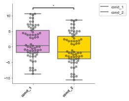
[4]:
# Now we'll do an example where we look at the logFC between two conditions
# of a group of genes and test whether they are significantly different.

# Pretend we have two conditions
df['cond_1'] = df['logfc'] + 1
df['cond_2'] = df['logfc'] - 1

boxplot = Boxplot(df, x='external_gene_name', y='logfc')
hox_genes = [g for g in df['external_gene_name'].values if 'HOX' in g]
# conditions: list, filter_column=None, filter_values=None
formatted_df = boxplot.format_data_for_boxplot(
                   df,
                   conditions=["cond_1", "cond_2"],
                   filter_column="external_gene_name",
                   filter_values=hox_genes
                )
print(formatted_df)

# Reinitialise boxplot with the new data
boxplot = Boxplot(formatted_df, "Conditions", "Values",
                  box_colors=["plum", "gold"],
                  add_dots=True)
boxplot.plot()
    Samples  Values Conditions
0    cond_1     0.0     cond_1
1    cond_2    -2.0     cond_2
2    cond_1    -1.8     cond_1
3    cond_2    -3.8     cond_2
4    cond_1    -6.9     cond_1
..      ...     ...        ...
125  cond_2    -2.4     cond_2
126  cond_1     7.0     cond_1
127  cond_2     5.0     cond_2
128  cond_1    -7.7     cond_1
129  cond_2    -9.7     cond_2

[130 rows x 3 columns]
p-value annotation legend:
ns: 5.00e-02 < p <= 1.00e+00
*: 1.00e-02 < p <= 5.00e-02
**: 1.00e-03 < p <= 1.00e-02
***: 1.00e-04 < p <= 1.00e-03
****: p <= 1.00e-04

cond_1 v.s. cond_2: Mann-Whitney-Wilcoxon test two-sided with Bonferroni correction, P_val=2.169e-02 U_stat=2.606e+03
[4]:
<AxesSubplot:>
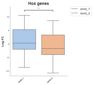
Advanced sytle options
Here are some examples where things like the bin, color and fig size have been changed.
[5]:
# boxplot = Boxplot(df: pd.DataFrame, x: object, y: object, title='', xlabel='', ylabel='', box_colors=None,
#                 hue=None, order=None, hue_order=None, showfliers=False, add_dots=False, add_stats=True,
#                 stat_method='Mann-Whitney', box_pairs=None, figsize=(3, 3), title_font_size=12, label_font_size=8, title_font_weight=700)# Config options = any of the parameters with the same name but with in a dictionary format instead

# Let's continue with the previous example with the formatted data

boxplot = Boxplot(df=formatted_df, x='Conditions', y='Values', title='Hox genes', xlabel='', ylabel='Log FC',
                  box_colors=None, # An ordered list of colours to match the conditions
                  hue=None, # A column in your dataset that you want to colour by
                  order=None, # Order of the box's
                  hue_order=None, # order of the colours
                  showfliers=False, # Show fliers (on the box's)
                  add_dots=False,  # Add dots for each data point
                  add_stats=True, # Add statistics between box's pairwise tests
                  stat_method='Mann-Whitney', # Type of stat
                  box_pairs=None, # Pre-specified comparisons (if you don't want to do all pairs)
                  figsize=(3, 3),
                  title_font_size=12,
                  label_font_size=8,
                  title_font_weight=700, # Config options = any of the parameters with the same name but with in a dictionary format instead
                  # You could also pass these as individual parameters, but it's easier to set as a dictionary
                  # also, then you can re-use it for other charts!
                  config={'figsize':(4, 5),  # Size of figure (x, y)
                       'title_font_size': 16, # Size of the title (pt)
                       'label_font_size': 12, # Size of the labels (pt)
                       'title_font_weight': 700, # 700 = bold, 600 = normal, 400 = thin
                       'font_family': 'sans-serif', # 'serif', 'sans-serif', or 'monospace'
                       'font': ['Tahoma'] # Default: Arial  # http://jonathansoma.com/lede/data-studio/matplotlib/list-all-fonts-available-in-matplotlib-plus-samples/
                  })
boxplot.plot()
plt.show()
p-value annotation legend:
ns: 5.00e-02 < p <= 1.00e+00
*: 1.00e-02 < p <= 5.00e-02
**: 1.00e-03 < p <= 1.00e-02
***: 1.00e-04 < p <= 1.00e-03
****: p <= 1.00e-04

cond_1 v.s. cond_2: Mann-Whitney-Wilcoxon test two-sided with Bonferroni correction, P_val=2.169e-02 U_stat=2.606e+03
Show multiple comparisons
In this one we have an example where we have two conditions for two groups of genes.
[6]:
# Pretend we have two conditions
df['cond_1'] = df['logfc'] + 1
df['cond_2'] = df['logfc'] - 1
boxplot = Boxplot(df, x='external_gene_name', y='logfc')
mt_genes = [g for g in df['external_gene_name'].values if 'MT' in g]
hox_genes = [g for g in df['external_gene_name'].values if 'HOX' in g]
# conditions: list, filter_column=None, filter_values=None
hox_df = boxplot.format_data_for_boxplot(
df,
conditions=["cond_1", "cond_2"],
filter_column="external_gene_name",
filter_values=hox_genes)
# Add another column to the hox df that's the label
hox_df['Gene Group'] = 'Hox'
# Create a df for the MT genes
mt_df = boxplot.format_data_for_boxplot(
df,
conditions=["cond_1", "cond_2"],
filter_column="external_gene_name",
filter_values=mt_genes)
# Add another column to the hox df that's the label
mt_df['Gene Group'] = 'MT'
gene_df = pd.concat([hox_df, mt_df])
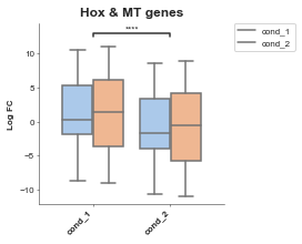
# Now we set hue
boxplot = Boxplot(df=gene_df, x='Conditions', y='Values', title='Hox & MT genes', xlabel='', ylabel='Log FC',
box_colors=None, # An ordered list of colours to match the conditions
hue='Gene Group', # A column in your dataset that you want to colour by
order=None, # Order of the box's
hue_order=None, # order of the colours
showfliers=False, # Show fliers (on the box's)
add_dots=False, # Add dots for each data point
add_stats=True, # Add statistics between box's pairwise tests
stat_method='t-test_ind', # Type of stat
box_pairs=None, # Pre-specified comparisons (if you don't want to do all pairs)
figsize=(3, 3),
title_font_size=12,
label_font_size=8,
title_font_weight=700) # Config options = any of the parameters with the same name but with in a dictionary format instead)
boxplot.plot()
plt.show()
p-value annotation legend:
ns: 5.00e-02 < p <= 1.00e+00
*: 1.00e-02 < p <= 5.00e-02
**: 1.00e-03 < p <= 1.00e-02
***: 1.00e-04 < p <= 1.00e-03
****: p <= 1.00e-04

cond_1 v.s. cond_2: t-test independent samples with Bonferroni correction, P_val=1.843e-13 stat=7.417e+00
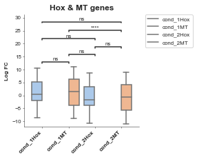
Another example
[7]:
# Pretend we have two conditions and two groups of genes we want to identify the significance between
df['cond_1'] = df['logfc'] + 1
df['cond_2'] = df['logfc'] - 1
boxplot = Boxplot(df, x='external_gene_name', y='logfc')
mt_genes = [g for g in df['external_gene_name'].values if 'MT' in g]
hox_genes = [g for g in df['external_gene_name'].values if 'HOX' in g]
# conditions: list, filter_column=None, filter_values=None
hox_df = boxplot.format_data_for_boxplot(
df,
conditions=["cond_1", "cond_2"],
filter_column="external_gene_name",
filter_values=hox_genes)
# Add another column to the hox df that's the label
hox_df['Gene Group'] = 'Hox'
hox_df['Conditions'] = hox_df['Conditions'].values + hox_df['Gene Group'].values
# Create a df for the MT genes
mt_df = boxplot.format_data_for_boxplot(
df,
conditions=["cond_1", "cond_2"],
filter_column="external_gene_name",
filter_values=mt_genes)
# Add another column to the hox df that's the label
mt_df['Gene Group'] = 'MT'
mt_df['Conditions'] = mt_df['Conditions'].values + mt_df['Gene Group'].values
gene_df = pd.concat([hox_df, mt_df])
#
boxplot = Boxplot(df=gene_df, x='Conditions', y='Values', title='Hox & MT genes', xlabel='', ylabel='Log FC',
hue='Gene Group') # A column in your dataset that you want to colour by) # Config options = any of the parameters with the same name but with in a dictionary format instead)
boxplot.plot()
plt.show()
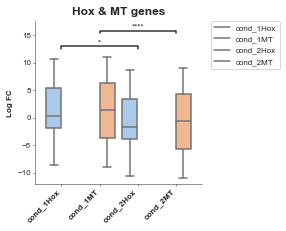
# Let's limit our tests to only the comparisons between things we're interested in
boxplot = Boxplot(df=gene_df, x='Conditions', y='Values', title='Hox & MT genes', xlabel='', ylabel='Log FC',
hue='Gene Group',
box_pairs=[('cond_1Hox', 'cond_2Hox'),
('cond_1MT', 'cond_2MT'),
])
boxplot.plot()
plt.show()
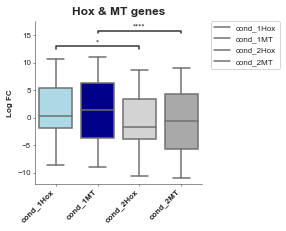
# Alternatively instead of explicity setting the hue through seaborn we can do it manually (but the legend won't come up)
# I personally prefer this and just manually set the label, it's a to do to add it in.
# Let's limit our tests to only the comparisons between things we're interested in
boxplot = Boxplot(df=gene_df, x='Conditions', y='Values', title='Hox & MT genes', xlabel='', ylabel='Log FC',
box_colors=['lightblue', 'darkblue', 'lightgrey', 'darkgrey'],
box_pairs=[('cond_1Hox', 'cond_2Hox'),
('cond_1MT', 'cond_2MT'),
])
boxplot.plot()
plt.show()
p-value annotation legend:
ns: 5.00e-02 < p <= 1.00e+00
*: 1.00e-02 < p <= 5.00e-02
**: 1.00e-03 < p <= 1.00e-02
***: 1.00e-04 < p <= 1.00e-03
****: p <= 1.00e-04

cond_1Hox v.s. cond_1MT: Mann-Whitney-Wilcoxon test two-sided with Bonferroni correction, P_val=1.000e+00 U_stat=2.699e+04
cond_1MT v.s. cond_2Hox: Mann-Whitney-Wilcoxon test two-sided with Bonferroni correction, P_val=5.865e-02 U_stat=3.216e+04
cond_2Hox v.s. cond_2MT: Mann-Whitney-Wilcoxon test two-sided with Bonferroni correction, P_val=1.000e+00 U_stat=2.699e+04
cond_1Hox v.s. cond_2Hox: Mann-Whitney-Wilcoxon test two-sided with Bonferroni correction, P_val=1.301e-01 U_stat=2.606e+03
cond_1MT v.s. cond_2MT: Mann-Whitney-Wilcoxon test two-sided with Bonferroni correction, P_val=7.349e-11 U_stat=4.106e+05
cond_1Hox v.s. cond_2MT: Mann-Whitney-Wilcoxon test two-sided with Bonferroni correction, P_val=6.067e-02 U_stat=3.214e+04
p-value annotation legend:
ns: 5.00e-02 < p <= 1.00e+00
*: 1.00e-02 < p <= 5.00e-02
**: 1.00e-03 < p <= 1.00e-02
***: 1.00e-04 < p <= 1.00e-03
****: p <= 1.00e-04

cond_1Hox v.s. cond_2Hox: Mann-Whitney-Wilcoxon test two-sided with Bonferroni correction, P_val=4.338e-02 U_stat=2.606e+03
cond_1MT v.s. cond_2MT: Mann-Whitney-Wilcoxon test two-sided with Bonferroni correction, P_val=2.450e-11 U_stat=4.106e+05
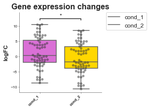
Saving
Saving is the same for all plots and v simple, just make sure you specify what ending you want it to have.
[10]:
# Now we'll do an example where we look at the logFC between two conditions
# of a group of genes and test whether they are significantly different.
df = pd.read_csv('volcano.csv')
df
# Pretend we have two conditions
df['cond_1'] = df['logfc'] + 1
df['cond_2'] = df['logfc'] - 1

boxplot = Boxplot(df, x='external_gene_name', y='logfc')
hox_genes = [g for g in df['external_gene_name'].values if 'HOX' in g]
# conditions: list, filter_column=None, filter_values=None
formatted_df = boxplot.format_data_for_boxplot(
                   df,
                   conditions=["cond_1", "cond_2"],
                   filter_column="external_gene_name",
                   filter_values=hox_genes
                )
print(formatted_df)

# Reinitialise boxplot with the new data
boxplot = Boxplot(formatted_df, "Conditions", "Values",
                  ylabel='logFC',
                  title='Gene expression changes',
                  box_colors=["orchid", "gold"],
                  add_dots=True,
                  config={'palette': ['orchid', 'paleturquoise', 'gold'],
                           'figsize':(3, 3),  # Size of figure (x, y)
                           's': 20,
                           'title_font_size': 16, # Size of the title (pt)
                           'label_font_size': 12, # Size of the labels (pt)
                           'title_font_weight': 700, # 700 = bold, 600 = normal, 400 = thin
                           'font_family': 'sans-serif', # 'serif', 'sans-serif', or 'monospace'
                           'font': ['Tahoma'] # Default: Arial  # http://jonathansoma.com/lede/data-studio/matplotlib/list-all-fonts-available-in-matplotlib-plus-samples/
                           })
boxplot.plot()
plt.savefig('boxplot.svg', bbox_inches='tight') # .png, .pdf, .jpg
plt.savefig('boxplot.png', dpi=300) # .png, .pdf, .jpg
plt.savefig('chart.pdf') # .png, .pdf, .jpg
    Samples  Values Conditions
0    cond_1     0.0     cond_1
1    cond_2    -2.0     cond_2
2    cond_1    -1.8     cond_1
3    cond_2    -3.8     cond_2
4    cond_1    -6.9     cond_1
..      ...     ...        ...
125  cond_2    -2.4     cond_2
126  cond_1     7.0     cond_1
127  cond_2     5.0     cond_2
128  cond_1    -7.7     cond_1
129  cond_2    -9.7     cond_2

[130 rows x 3 columns]
p-value annotation legend:
ns: 5.00e-02 < p <= 1.00e+00
*: 1.00e-02 < p <= 5.00e-02
**: 1.00e-03 < p <= 1.00e-02
***: 1.00e-04 < p <= 1.00e-03
****: p <= 1.00e-04

cond_1 v.s. cond_2: Mann-Whitney-Wilcoxon test two-sided with Bonferroni correction, P_val=2.169e-02 U_stat=2.606e+03